[pt-br] Sobre
-
Dra. Rebecca é pediatra e neonatologista e que por muito tempo trabalhou apenas em emergências, mas sempre ouvia das mães dos seus pacientes a mesma pergunta: "Onde você atende, doutora?". A partir disso Rebecca passou a atender em alguns consultórios e também a domicilio, com isso surgiu a necessidade de criar uma identidade visual para ela trabalhar sua marca e fortalecer o seu nome no mercado.
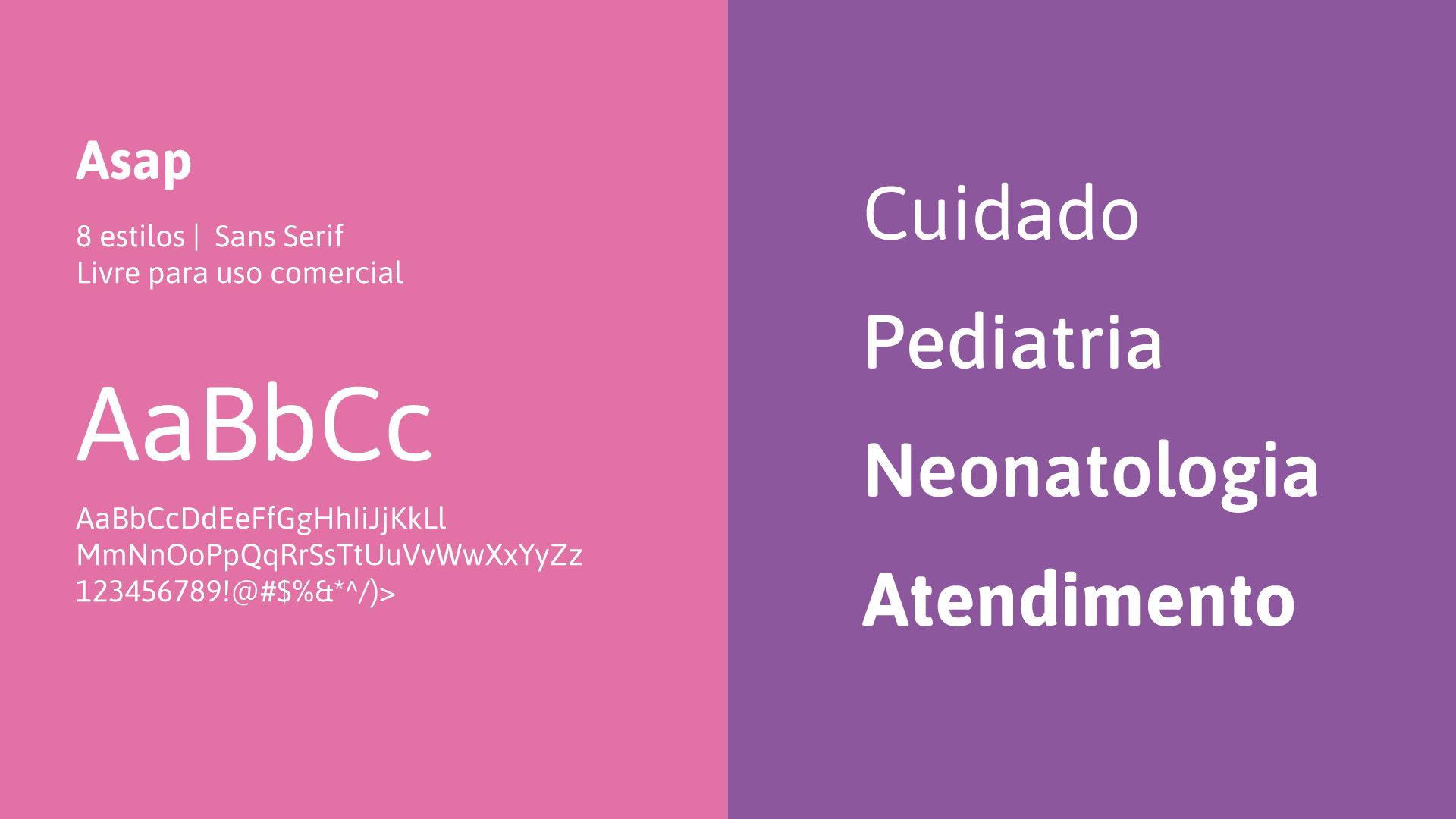
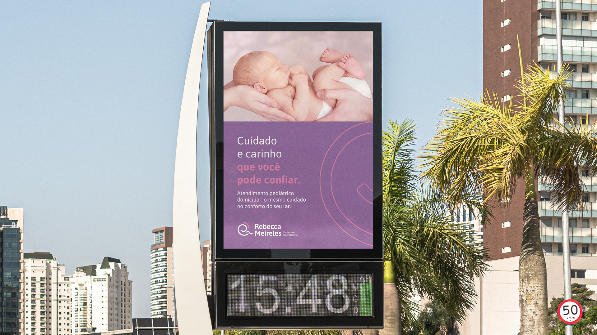
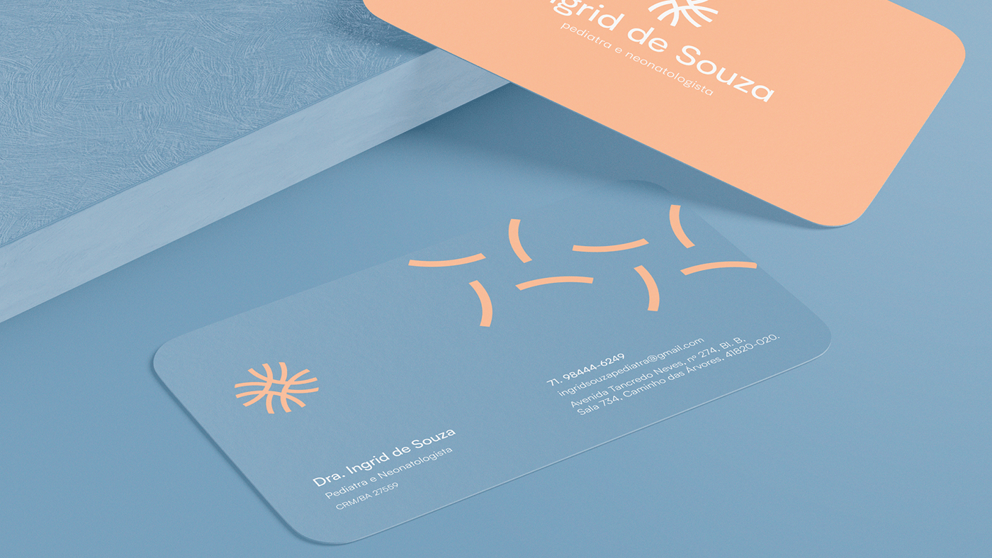
Era necessário desenvolver um projeto de identidade visual para o início de um novo momento da carreira da Dra. Rebecca. Uma identidade que transmitisse carinho, afeto, acolhimento e cuidado com cada paciente. Os elementos visuais devem ser leves e delicados, mas sem perder os aspectos que passam a confiança que um paciente deve ter em sua médica.
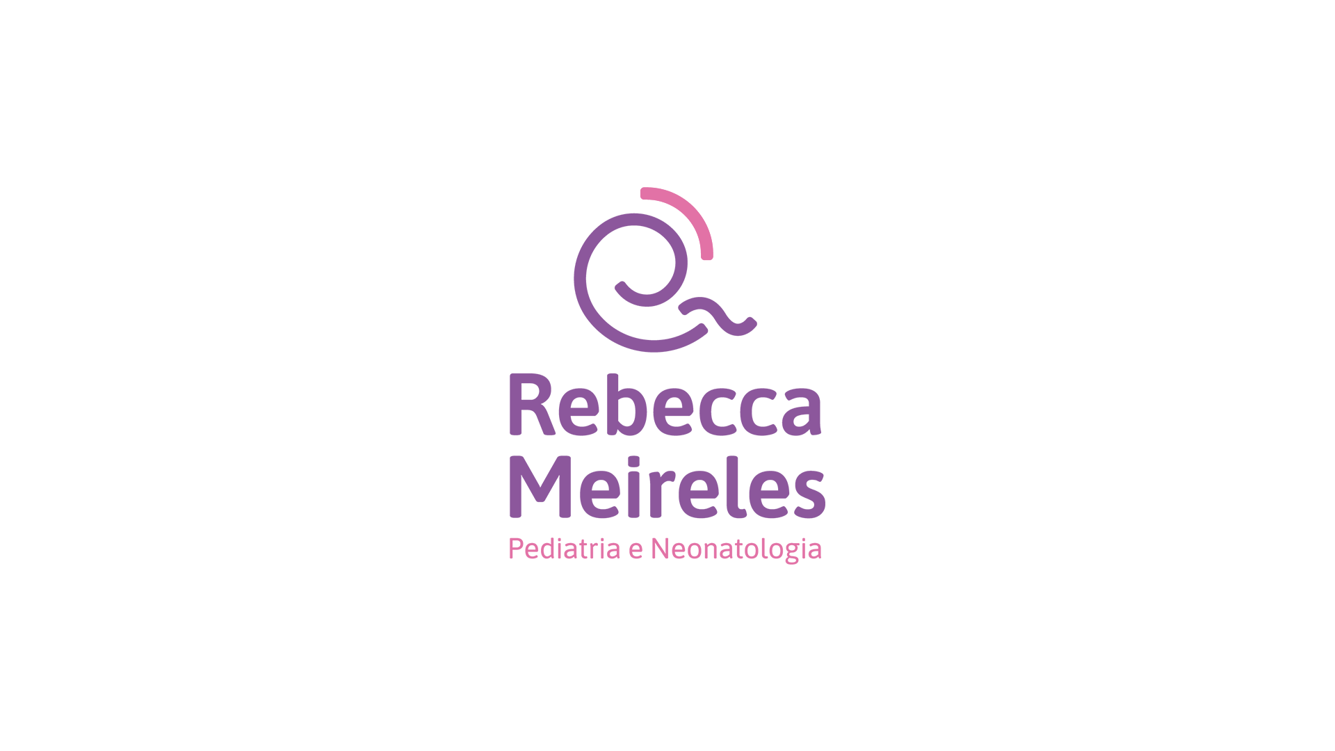
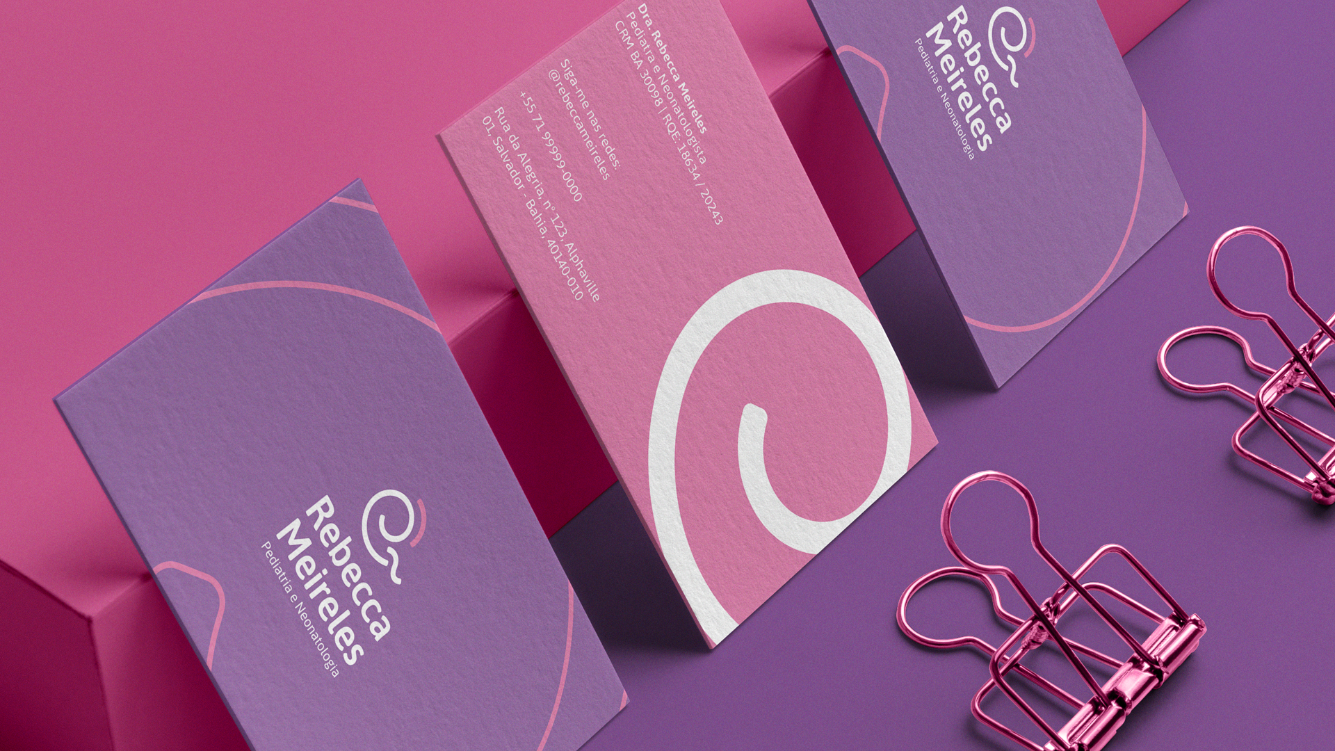
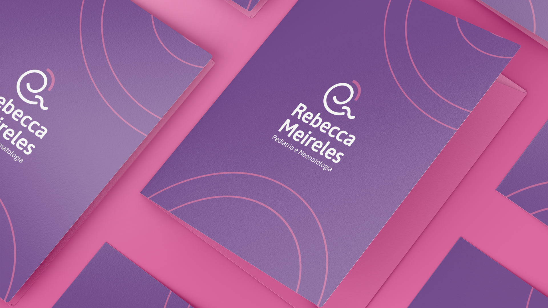
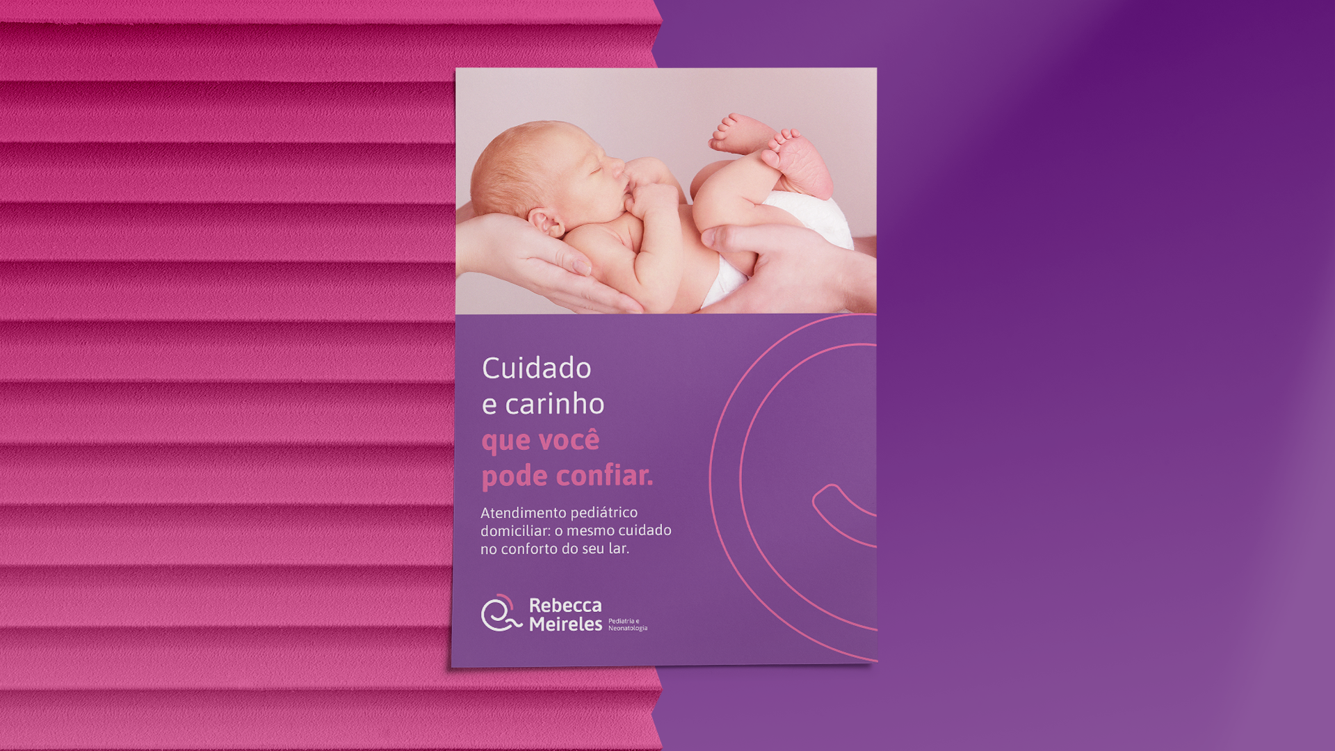
O símbolo criado foi inspirado no cuidado, afeto e no atendimento humanizado. Ele representa umbebê sendo acolhido e protegido. É composto por 3 formas: uma espiral (corpo), uma forma ondulada (pernas) e uma curva (cuidado e proteção). Os cantos são arredondados com curvatura próxima a da tipografia para trazer unidade.
[en] About
-
Imagine a dedicated pediatrician, a doctor who has always been there in moments of emergency, caring for the little ones with all the attention and love they need. That's Dr. Rebecca Meireles. However, she started hearing a recurring question from the mothers of her patients: 'Where do you practice, doctor?'
It was from this question that Dr. Rebecca decided to expand her practice, seeing patients in clinics and even offering home visits. But to strengthen her brand, she felt the need to create a visual identity that reflected her work and enhanced her name in the market.
And thus began a new chapter in Dr. Rebecca's career, where it was essential to develop a visual identity that conveyed warmth, affection, nurturing, and, of course, care for each patient. After all, trust between doctor and patient is fundamental.
The symbol created to represent Dr. Rebecca was inspired by the values she believes in: care, affection, and truly human-centered care. The symbol portrays a baby being embraced and protected, formed by three elements: a spiral representing the body, a wavy shape symbolizing the little legs, and a curve that expresses care and protection. The corners are rounded, in harmony with the chosen typography, to bring a sense of unity.
This visual identity project is the hallmark of Dr. Rebecca Meireles' new phase, a doctor who dedicates herself wholeheartedly to her patients, conveying security and empathy in every consultation.