SGS Engenharia | Identidade Visual
[pt-br] Sobre a SGS
-
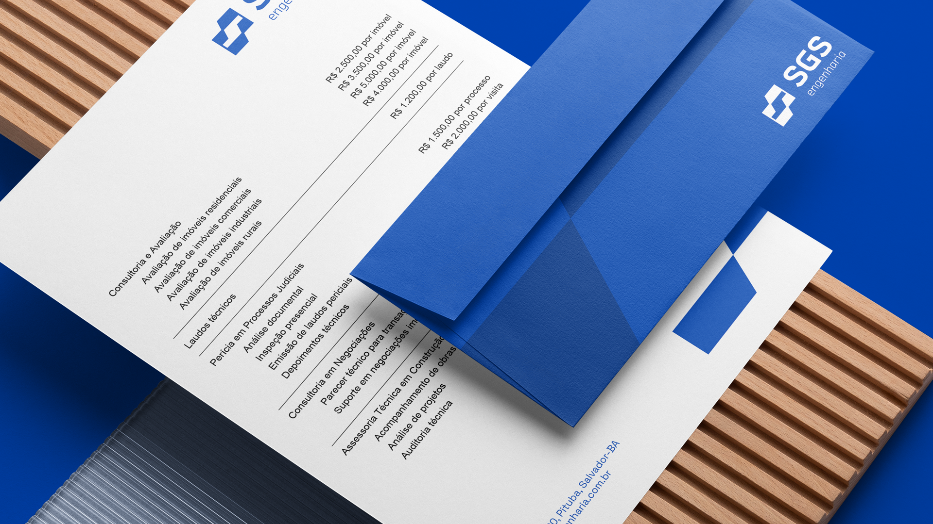
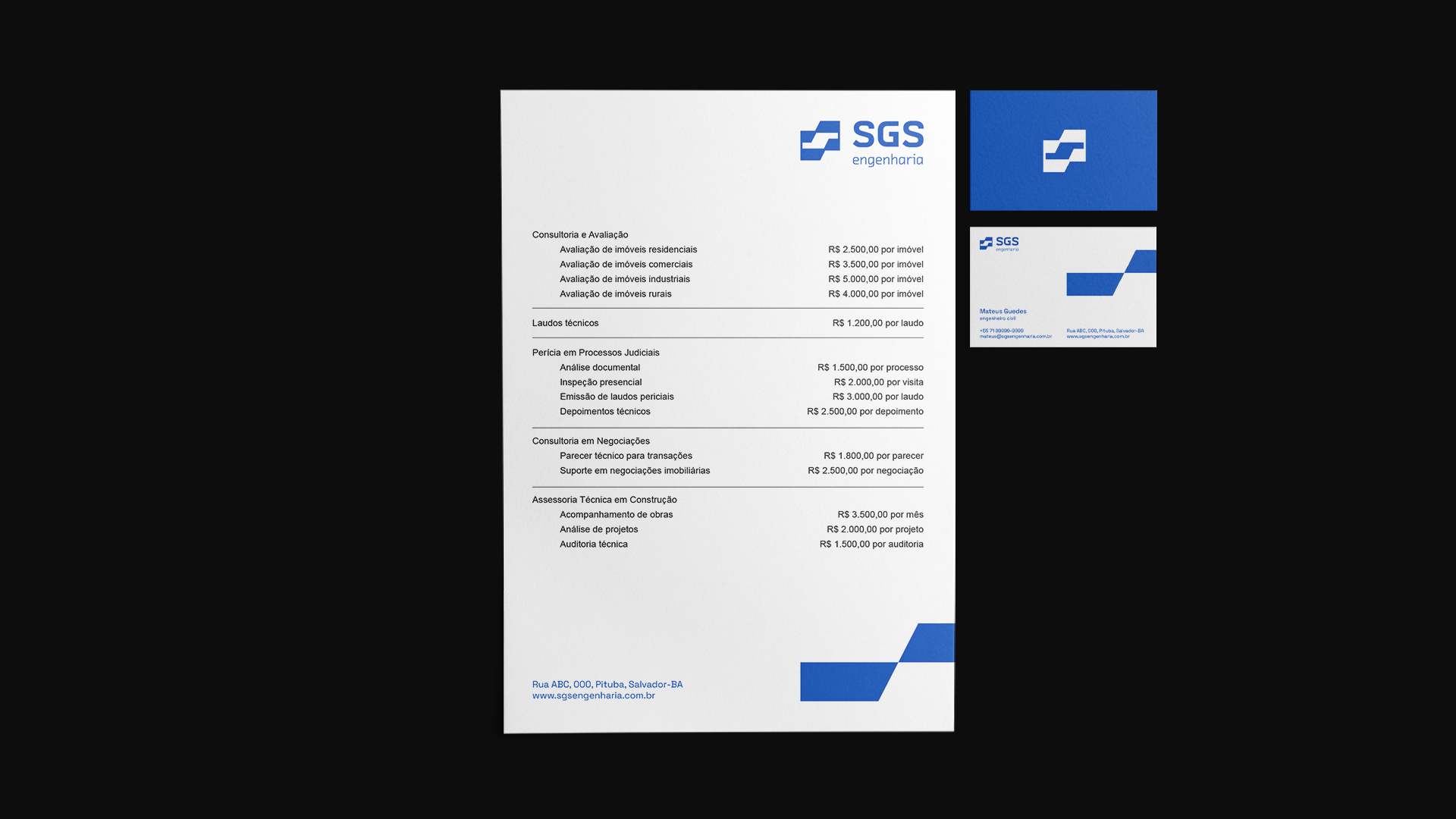
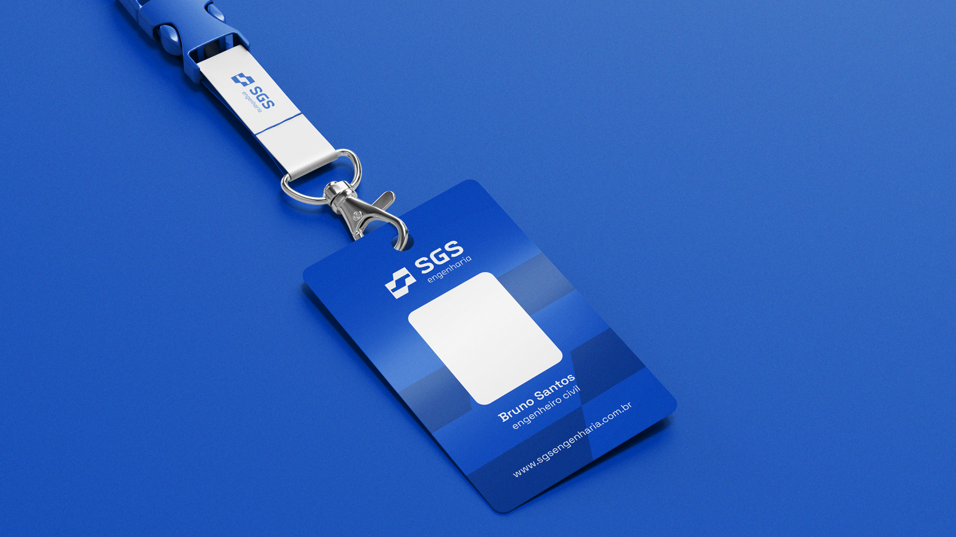
A SGS é uma empresa de engenharia formada pelos sócios Mateus e Bruno que atua principalmente com projetos de avaliação e perícia, mas pretendem expandir a esteira de serviços para contemplar também a área da construção.
Com o mercado formado em sua maioria por empresas experientes e com profissionais já maduros, a SGS enfrenta uma barreira por ser formada por jovens engenheiros.
Além disso, ela passou por uma mudança no quadro societário o que levou também a mudar de nome, deixando de ser a 4A Engenharia. Sendo esse um dos motivos para realizar o projeto de identidade visual.
[en] About the SGS
-
-
SGS is an engineering company formed by the partners Mateus and Bruno that works mainly with evaluation and expertise projects, but they intend to expand the range of services to also include the construction area.
With the market formed mostly by experienced companies and already mature professionals, SGS faces a barrier because it is formed by young engineers.
In addition, it underwent a change in the corporate structure, which also led to a name change, ceasing to be 4A Engenharia. This is one of the reasons for carrying out the visual identity project.
[pt-br] Sobre o Projeto
-
-
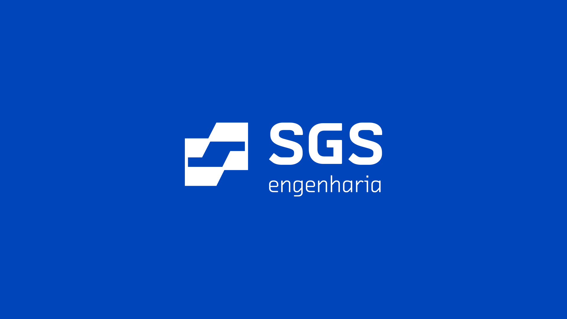
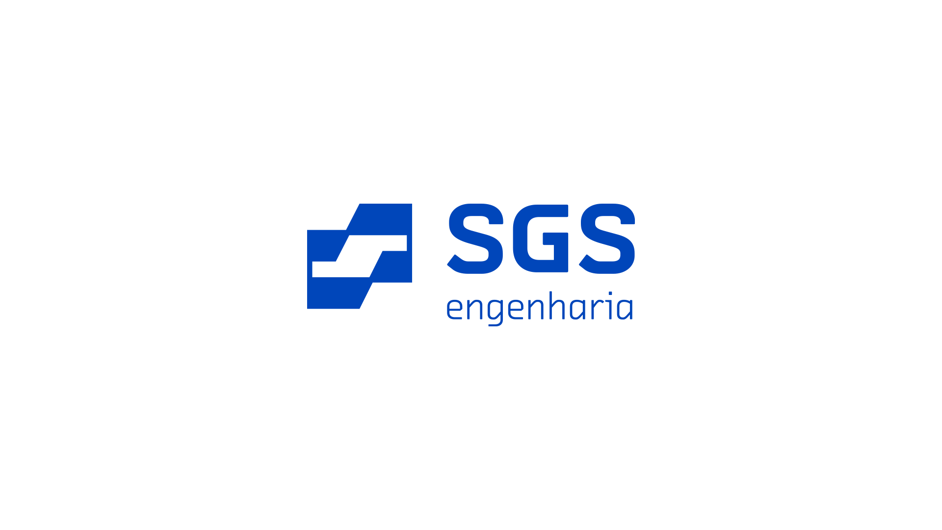
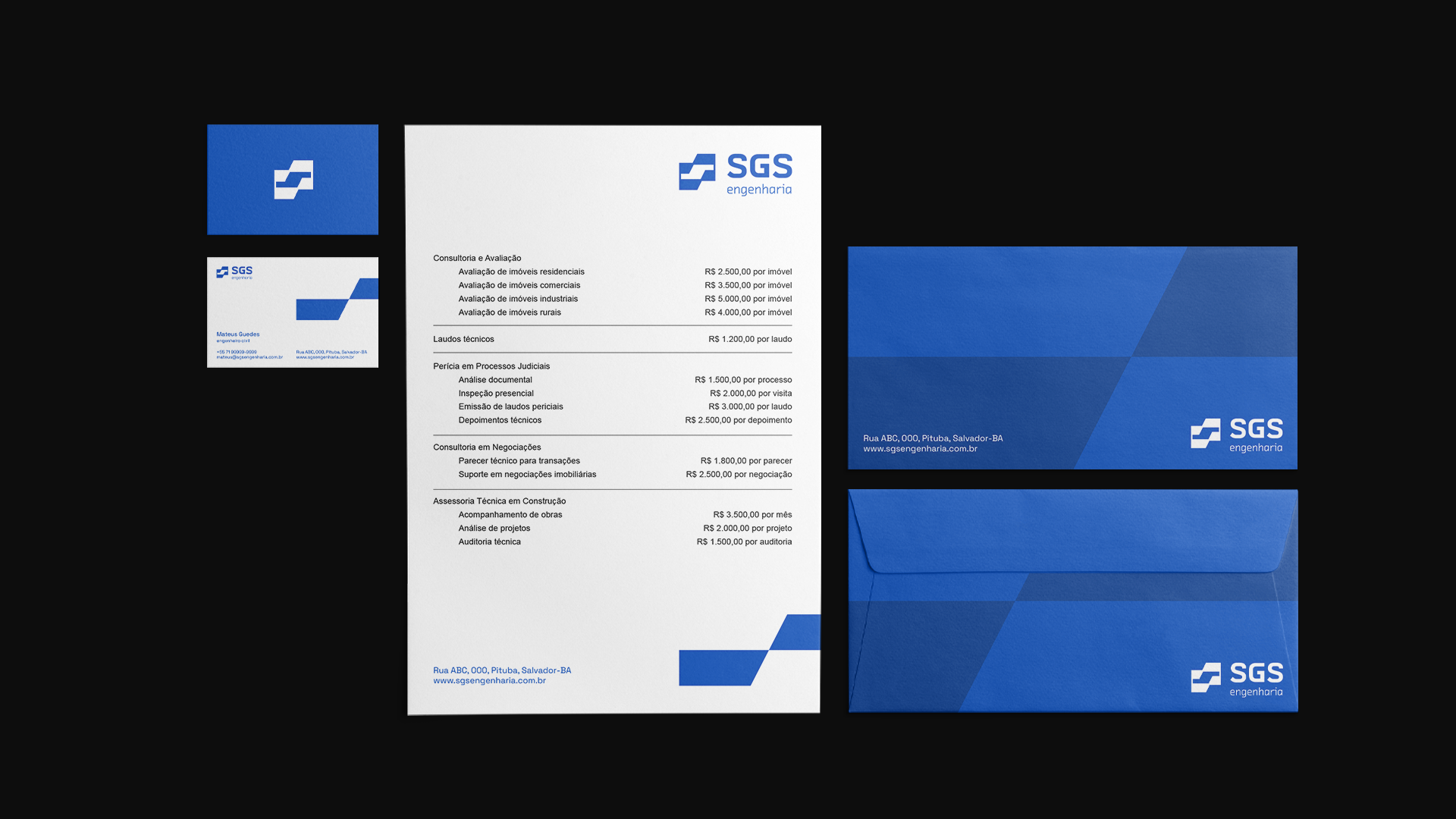
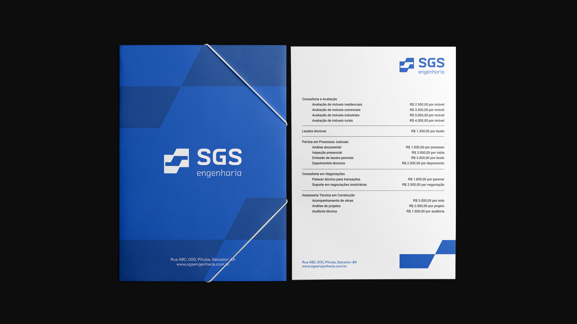
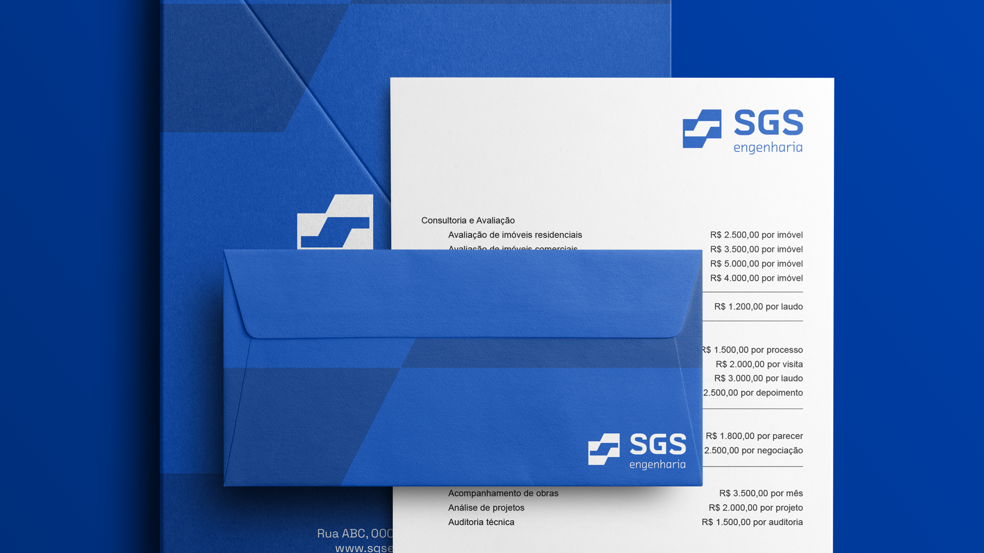
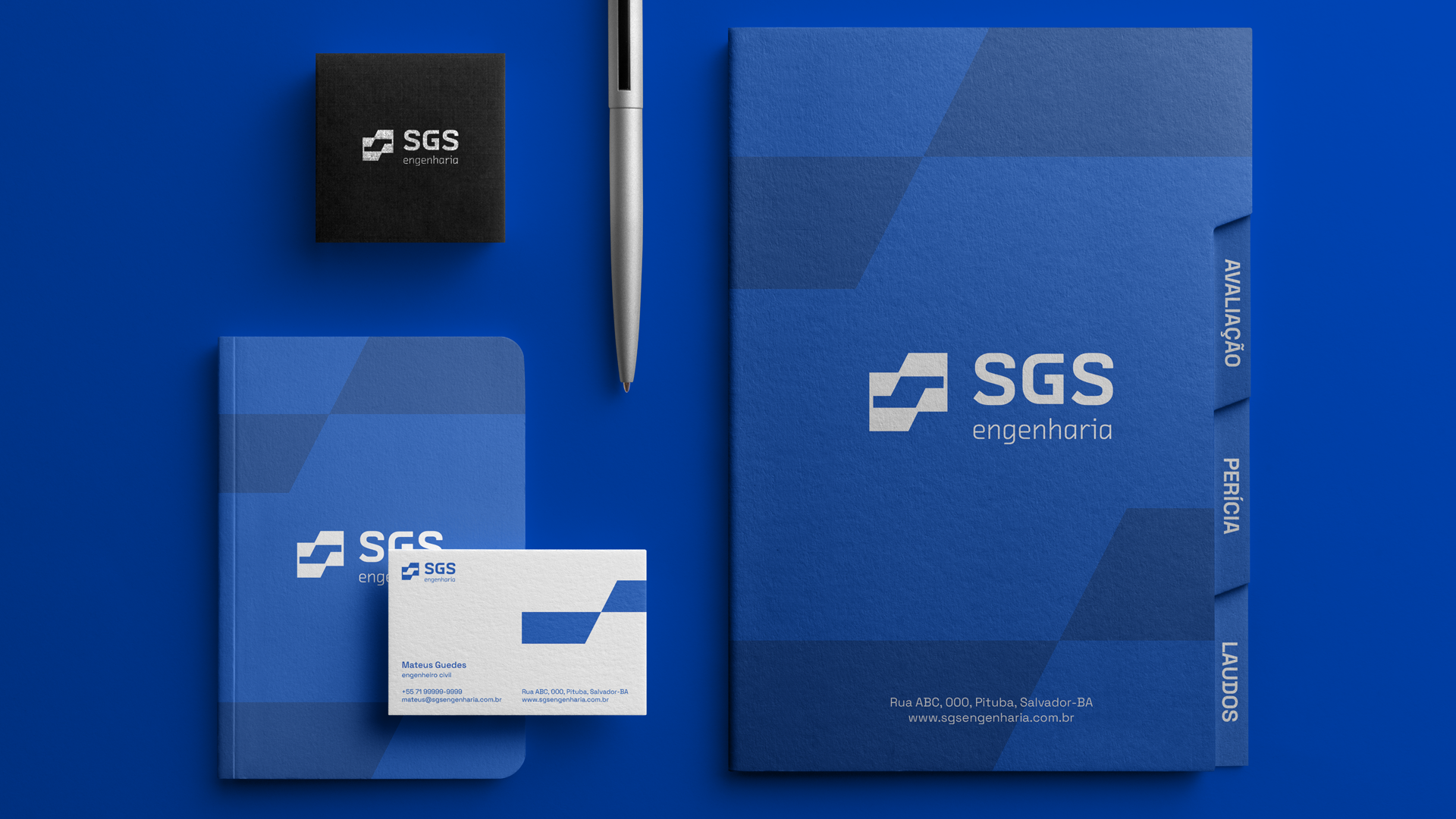
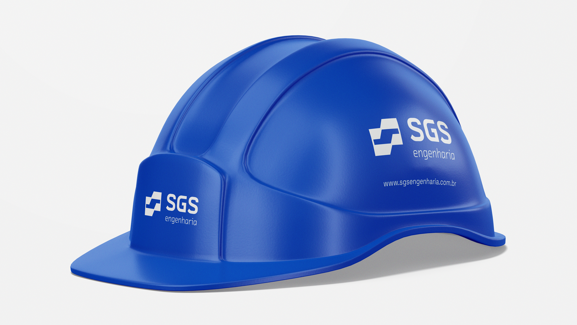
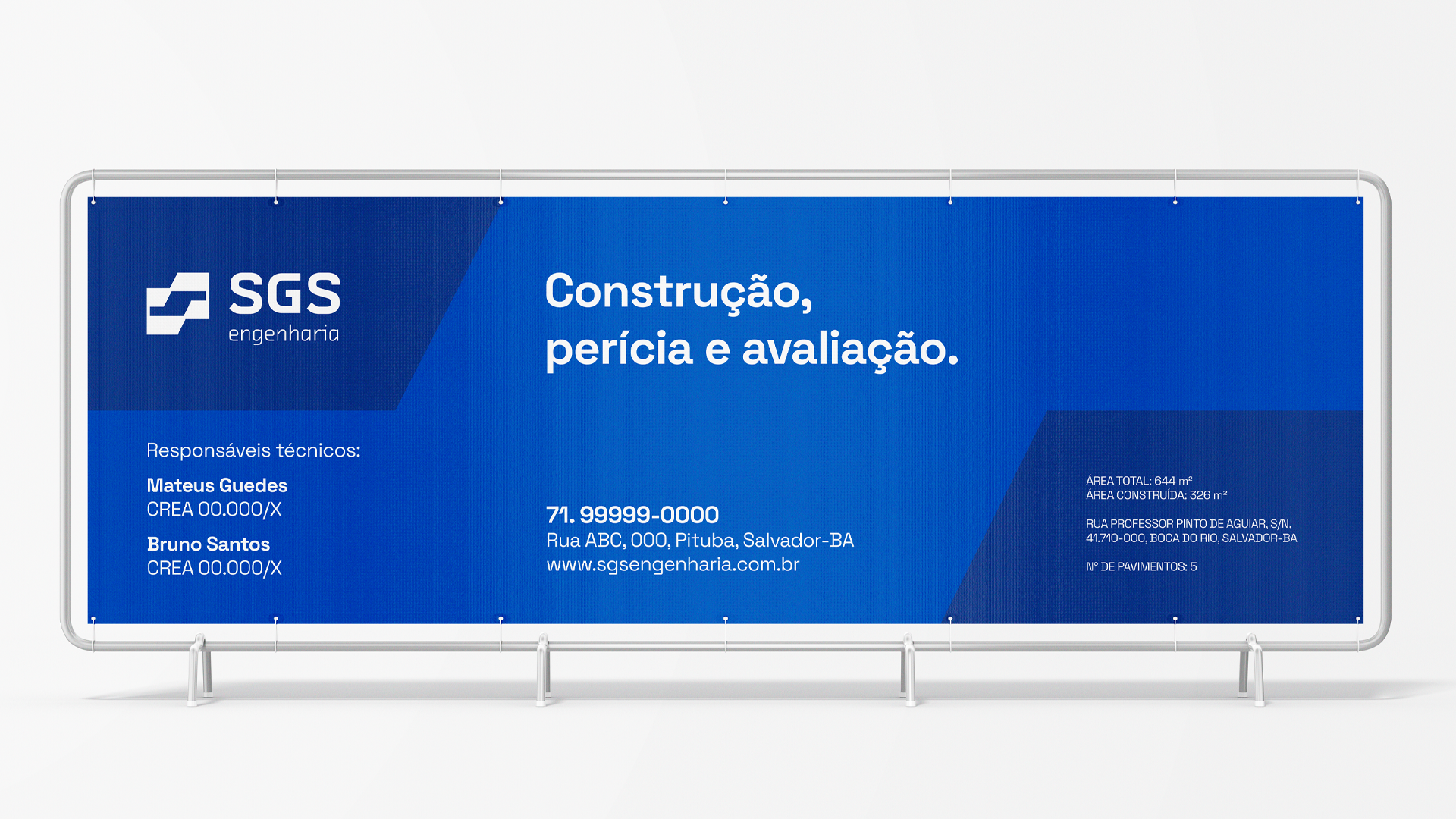
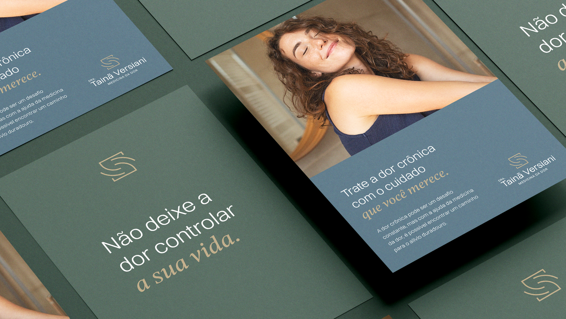
O projeto precisa transmitir experiência, maturidade e confinça. Por isso, segui por uma linha criativa que unisse elementos já presentes no mercado, como linhas retas e formas geométricas. Assim a gente consegue passar a sensação de uma empresa já presente no mercado e maturidade. Para trazer modernidade e mais suavidade ao logotipo, utilizei uma tipografia que mistura linhas retas com cantos arredondados.
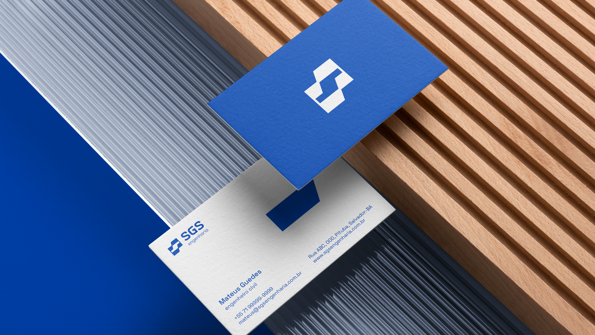
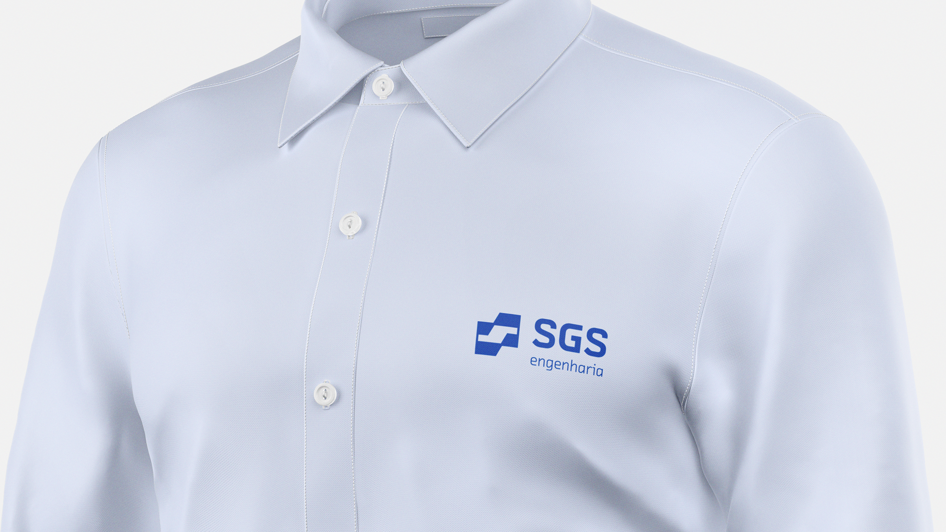
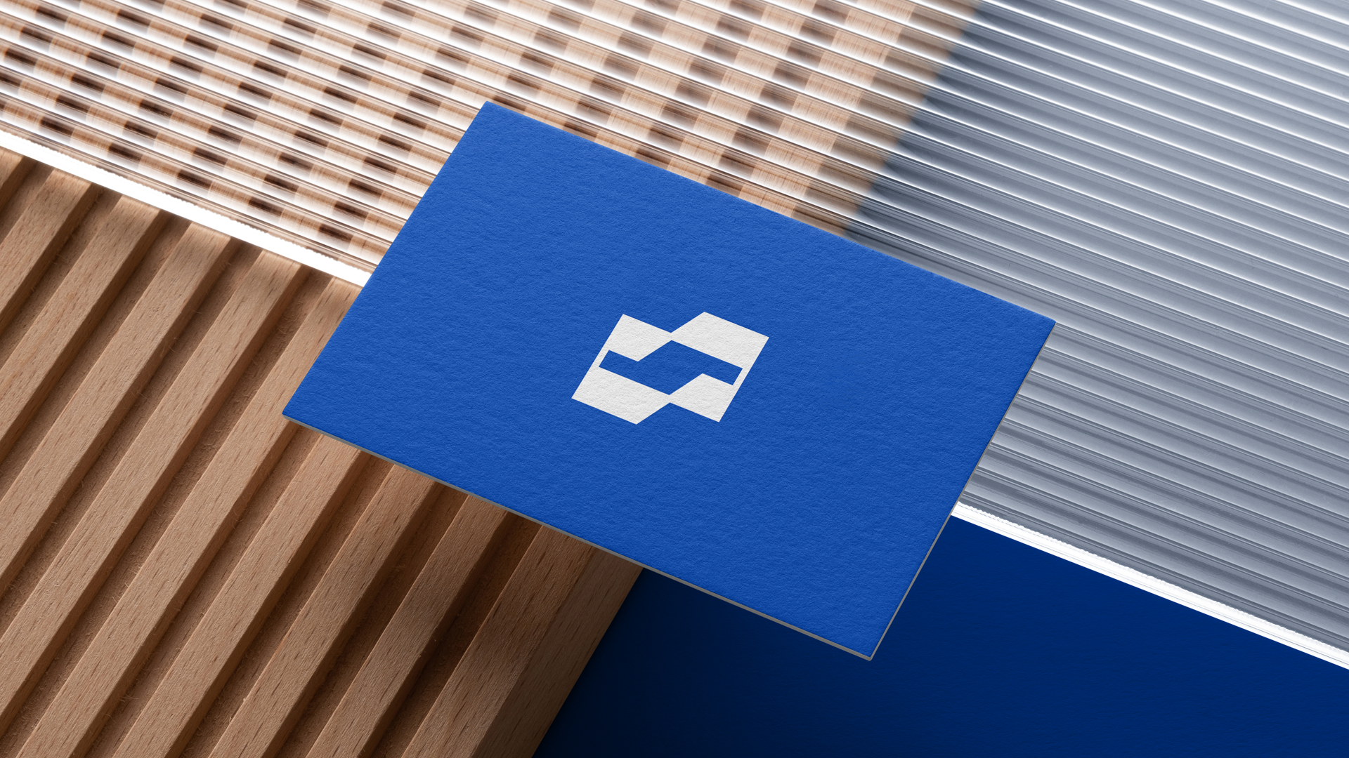
O símbolo criado usa linhas retas, elementos já presentes no universo da engenharia. Ele nos remete a uma forma abstrata de duas construções vistas sob perspectiva isométrica; Área de construção e projeto; A letra “S” presente na parte vazada; Sensação de crescimento e evolução.
[en] About the Project
-
-
The project needs to convey experience, maturity and confidence. Therefore, I followed a creative line that united elements already present in the market, such as straight lines and geometric shapes. This way we manage to convey the feeling of a company already present in the market and maturity. To bring modernity and more smoothness to the logo, I used a typography that mixes straight lines with rounded corners.
The symbol created uses straight lines, elements already present in the world of engineering. It reminds us of an abstract form of two buildings seen from an isometric perspective; Construction and design area; The letter “S” present in the hollow part; Feeling of growth and evolution.